Self-Mapping App
The guided entry point for visitors who want to experience the method directly.
Map the self, export the data, inspect the structure. The platform has two halves — a guided self-mapping app and a research dashboard — that together carry a study from participant session to publication-ready outputs. Both run entirely in the browser.
The guided entry point for visitors who want to experience the method directly.
The analytics layer that turns mapped selves into interpretable cohort summaries, visual profiles, and exploratory structure.
Each tool has a dedicated researcher's manual documenting the participant experience, the analytic surface, the data structure, and the design decisions behind every screen. Both are released under CC BY-NC 4.0.
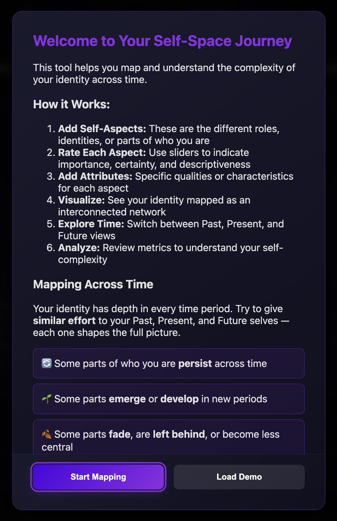
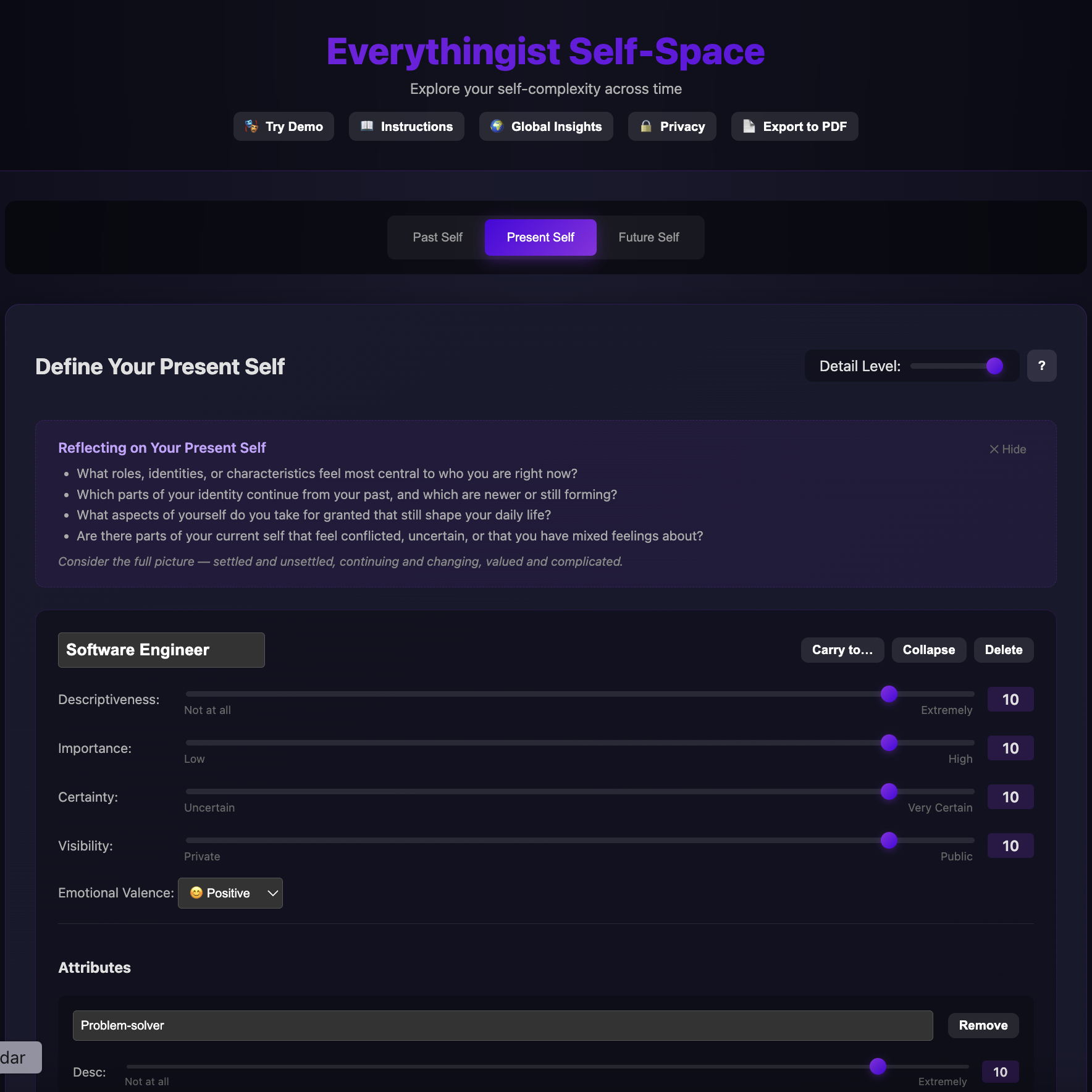
A researcher's walkthrough of the participant-facing self-complexity instrument — every screen, every choice, every affordance that quietly shapes the data.
The analytic workflow over self-complexity, identity strength, salience, and longitudinal change — running entirely in your browser.
An exploratory network of identity co-occurrence across the cohort, with drill-down details for selected identities. The dashboard pairs this view with cross-period descriptive analytics and profile-based metrics.
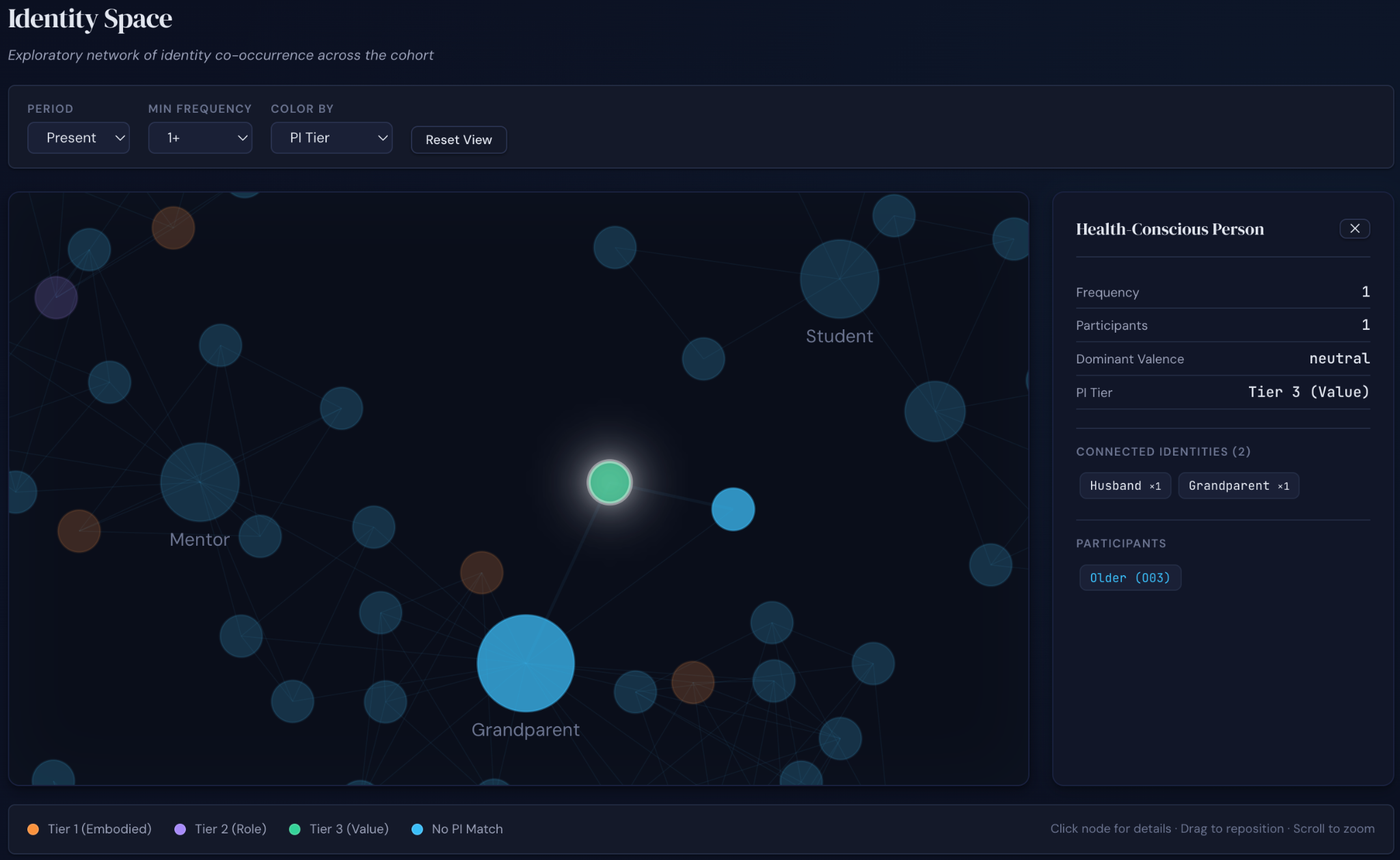
Click any node to inspect the participants who reported that identity, the attributes most associated with it, and how it connects to the rest of the cohort's identity space.
From the welcome screen, to identity mapping, to a three-period view of the participant's own self-space, to network visualization, to profile-based metrics. Each screen is a step in the participant-to-publication pipeline.
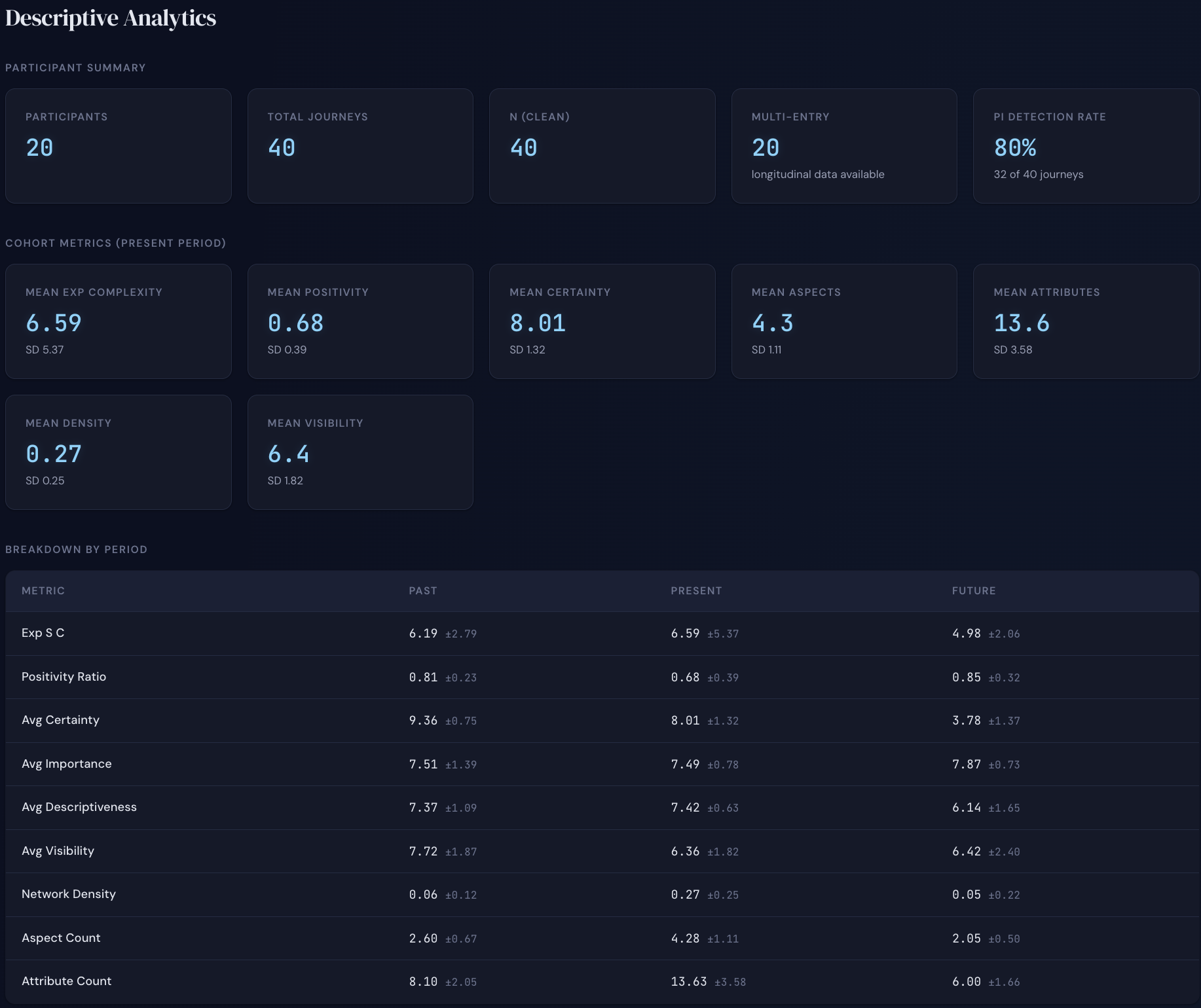
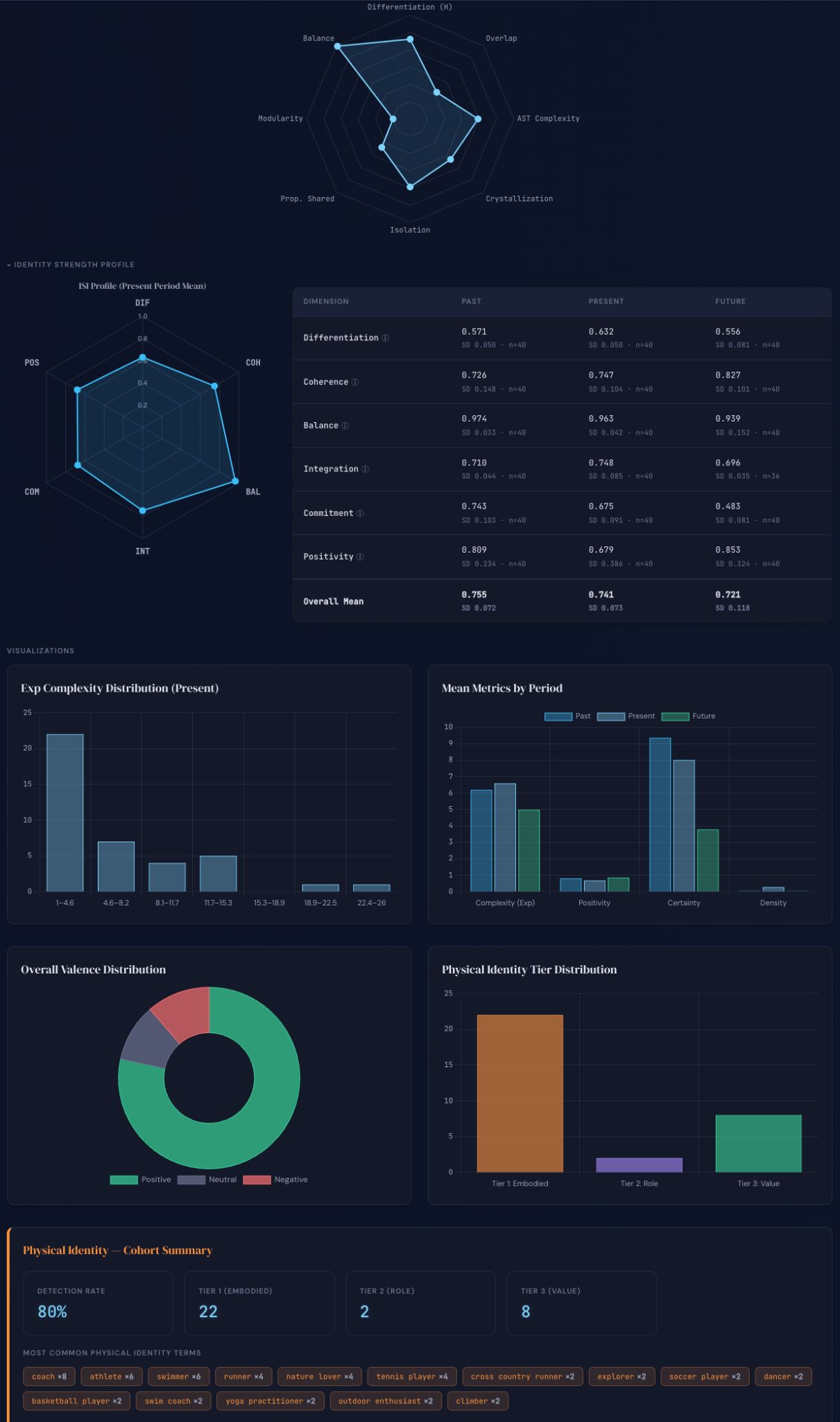
Distributions, period-by-period comparisons, cohort-level summaries, and physical-identity detection across participants — the kind of analytic outputs a methods section needs.
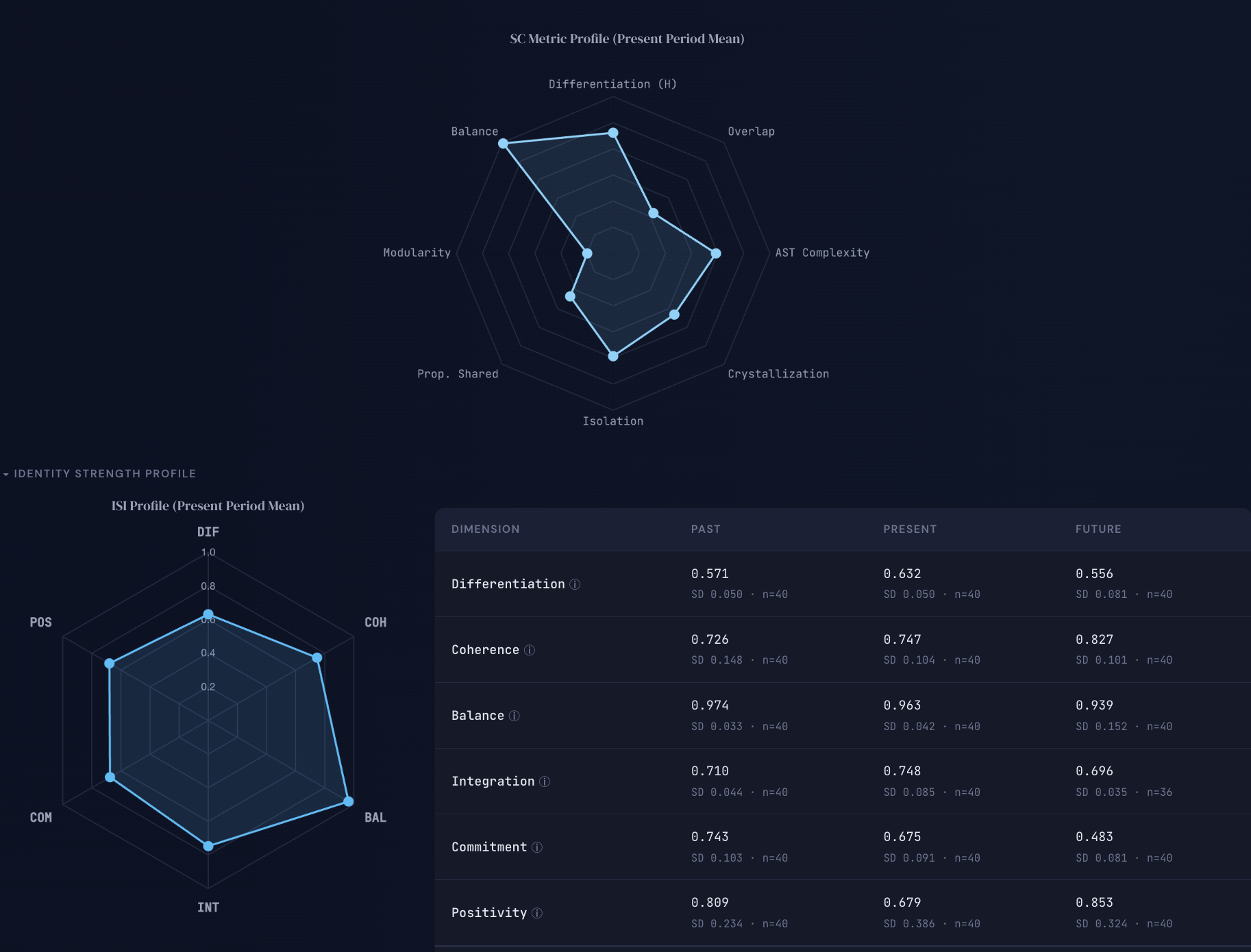
The dashboard reports self-complexity as a profile organized by dimension — quantity, overlap, geometry, structure, connectivity, network, and distribution — alongside the six-dimension Identity Strength Index profile.
A short walkthrough of the app and dashboard will be embedded here. Until then, the fastest way to see the platform is to launch the tools directly.
If you are considering using these tools in a study, the Resources, Measurement, and In a Study pages walk you from foundational literature to a citable methods workflow.
The classic theory and measurement papers that ground self-complexity research, including the works the measurement specification builds on directly.
Formulas, operational definitions, and notes on how the platform handles legacy and novel metrics — including the Self-Complexity Measurement Specification, the Identity Strength Index, the Salience Specification, and Identity Archetypes.
Versioned specifications, browser-based tools, and exportable JSON outputs make replication realistic. OSF materials and preprints will be added as they are posted.